Re: Compromising Kit Designs
Fri May 11, 2012 6:23 pm
Daniel M wrote:Cardiff Daft! wrote:for the 2nd one try putting a big bluebird on it.
Like such?
Difficult to make it appear as prominent as the dragon on the home, mainly as it's more of a large/bulkier shape as opposed to the detailed dragon perhaps.

I think that looks better on Red than the Dragon ddi. The Dragon shape was too complicated and a bit har to see. Was 100% fine on the blue shirt though

Re: Compromising Kit Designs
Fri May 11, 2012 6:25 pm
Daniel M wrote:Cardiff Daft! wrote:for the 2nd one try putting a big bluebird on it.
Like such?
Difficult to make it appear as prominent as the dragon on the home, mainly as it's more of a large/bulkier shape as opposed to the detailed dragon perhaps.
cheers for trying,
your pretty nifty with this, wasted talent if this is all you use it for!!
Re: Compromising Kit Designs
Fri May 11, 2012 6:26 pm
Daniel M wrote:RJ12 wrote:Daniel M wrote:I did a reserve version for the away kit, here's what the two would look like:
Tweeted it to Steve Borley as well if anyone fancies retweeting it or giving me a follow- https://twitter.com/#!/Daniel_CCFC/status/200965937699094528
i really like them both, but the idea of an away kit is that it doesn't clash with the opposition's colours!
Here is a third kit to avoid clashes


Fair play mate, these are top notch
Re: Compromising Kit Designs
Fri May 11, 2012 6:40 pm
the 2nd one is the dogs bollocks...
Re: Compromising Kit Designs
Fri May 11, 2012 6:44 pm
Cardiff Daft! wrote:your pretty nifty with this, wasted talent if this is all you use it for!!
Thanks for the kind words, I'm only 17 so many years ahead of be plan to get involved in graphics/web design in future so encouraging to see people appreciate my work
Re: Compromising Kit Designs
Fri May 11, 2012 7:12 pm
Daniel M wrote:Cardiff Daft! wrote:your pretty nifty with this, wasted talent if this is all you use it for!!
Thanks for the kind words, I'm only 17 so many years ahead of be plan to get involved in graphics/web design in future so encouraging to see people appreciate my work
Daniel fantastic work, we just need you to get in front of TG and VT.
Re: Compromising Kit Designs
Fri May 11, 2012 7:13 pm
Daniel M wrote:Cardiff Daft! wrote:for the 2nd one try putting a big bluebird on it.
Like such?
Difficult to make it appear as prominent as the dragon on the home, mainly as it's more of a large/bulkier shape as opposed to the detailed dragon perhaps.
The bluebird is a nice touch but vt wanted a Dragon and your original design had both the colour red and a welsh Dragon prominent in its design but kept blue as the primary colour. Your designs are the mutts nuts, brilliant, this thread has to made a sticky for all members to see and hopefully the people at the top will see them and I for one would be happy to see our team running out in your kit next season.
Re: Compromising Kit Designs
Fri May 11, 2012 7:14 pm
Blackwood_Bluebird wrote:The second merged shirt is very well done... I like it and think it would be a good compromise
I would buy the merged kit even if it wasn't a compromise and it was just our new kit. I love it!
Re: Compromising Kit Designs
Fri May 11, 2012 7:14 pm
Einstein wrote:Daniel M wrote:Cardiff Daft! wrote:your pretty nifty with this, wasted talent if this is all you use it for!!
Thanks for the kind words, I'm only 17 so many years ahead of be plan to get involved in graphics/web design in future so encouraging to see people appreciate my work
Daniel fantastic work, we just need you to get in front of TG and VT.
Cheers they've been sent to the club by me and I've also got tweets from Steve Tucker, Borley and Barrie McAuliffe who said they would pass them on to the club although Barrie said it would be too late for them to be real but he'll still pass them on
Also if anyone has any of their own ideas or requests for potential ones I'll be happy to test them out and try and make them kits
Re: Compromising Kit Designs
Fri May 11, 2012 8:08 pm
I know they aren't the brightest of red's and blue's but put a slight twist on the kits. Used the Echo's badge.
This is a design from Puma's 2012/13 range and could be a design we've used for this season anyway. If you want to see Puma 2012/13 gone wrong, check Burnley's new shirt...
Re: Compromising Kit Designs
Fri May 11, 2012 8:16 pm
I like the understated red on that mate.
Re: Compromising Kit Designs
Fri May 11, 2012 8:32 pm
Bluebird For Life wrote:I like the understated red on that mate.
very Arsenal on their last year at highbury kind of colour.
Re: Compromising Kit Designs
Fri May 11, 2012 8:41 pm
TheHunter! wrote:Daniel M wrote:The pro-direct one with zig-zagged stripes is best IMO.
I had a go at making a red away kit with the proposed black trim, instead of dragon logo I used a watermark of it.
And an attempt at a mixed one:
Love the second one!!
Also like a few of the first posters


I love the mixed one! the Barcalona style with the dragon would be nice also!!
Re: Compromising Kit Designs
Fri May 11, 2012 8:42 pm
bakircioglu wrote:
I know they aren't the brightest of red's and blue's but put a slight twist on the kits. Used the Echo's badge.
This is a design from Puma's 2012/13 range and could be a design we've used for this season anyway. If you want to see Puma 2012/13 gone wrong, check Burnley's new shirt...
Like the old Arsenal and Roma!!
Re: Compromising Kit Designs
Fri May 11, 2012 8:43 pm
Taff on the Mersey wrote:Bluebird For Life wrote:I like the understated red on that mate.
very Arsenal on their last year at highbury kind of colour.
Must admit I'd forgotten about that kit but your right it is pretty similar.
Re: Compromising Kit Designs
Fri May 11, 2012 9:14 pm
i would gladly pay for that black and yellow kit and the blue with red dragon, hope the malaysians will take a good look at these mate, proper bo i tell thee lol
Re: Compromising Kit Designs
Fri May 11, 2012 9:32 pm
id have any of them as a compromise if VT would go with it!
Re: Compromising Kit Designs
Sat May 12, 2012 9:50 pm
Daniel M wrote:RJ12 wrote:Daniel M wrote:I did a reserve version for the away kit, here's what the two would look like:
Tweeted it to Steve Borley as well if anyone fancies retweeting it or giving me a follow
i really like them both, but the idea of an away kit is that it doesn't clash with the opposition's colours!
Here is a third kit to avoid clashes
fair play, that is quality!
Re: Compromising Kit Designs
Sat May 12, 2012 9:57 pm
RJ12 wrote:Daniel M wrote:RJ12 wrote:Daniel M wrote:I did a reserve version for the away kit, here's what the two would look like:
Tweeted it to Steve Borley as well if anyone fancies retweeting it or giving me a follow
i really like them both, but the idea of an away kit is that it doesn't clash with the opposition's colours!
Here is a third kit to avoid clashes
fair play, that is quality!
I like these kits, they combine both a feel of past & future of our club.
Re: Compromising Kit Designs
Sun May 13, 2012 6:56 am
Red or dead
Hope board see we are willing to listen
Hope board see we are willing to listen
You do not have the required permissions to view the files attached to this post.
Re: Compromising Kit Designs
Fri Apr 19, 2013 1:57 am
Bump.
Re: Compromising Kit Designs
Tue Apr 23, 2013 7:15 am
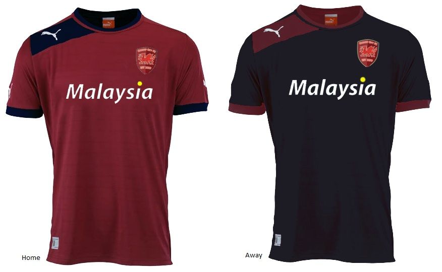
One I did back in August for the club, one of a 3 kit selection.. Didn't get anywhere with it tho.
Re: Compromising Kit Designs
Tue Apr 23, 2013 7:52 am
None of the designs actually matter to be honest as it all depends on templates provided by puma. And then the club choose from the templates. That's probably already been done.
Re: Compromising Kit Designs
Tue Apr 23, 2013 8:04 am
karlmpayne wrote:One I did back in August for the club, one of a 3 kit selection.. Didn't get anywhere with it tho.
I like that its really nice
Re: Compromising Kit Designs
Tue Apr 23, 2013 9:40 am
darran1927 wrote:karlmpayne wrote:One I did back in August for the club, one of a 3 kit selection.. Didn't get anywhere with it tho.
I like that its really nice
cheers mate
Re: Compromising Kit Designs
Tue Apr 23, 2013 9:58 am
karlmpayne wrote:None of the designs actually matter to be honest as it all depends on templates provided by puma. And then the club choose from the templates. That's probably already been done.
you should sell your designs to puma
Re: Compromising Kit Designs
Tue Apr 23, 2013 10:36 am
Karl, you should sponsor a team if you can and get your design out there in the public domain mate.
Honestly, you could make a fortune with your talent.
Honestly, you could make a fortune with your talent.
Re: Compromising Kit Designs
Tue Apr 23, 2013 11:07 am
It's all wasted on the dictator, we're lucky to still have our name, by all accounts 
Re: Compromising Kit Designs
Tue Apr 23, 2013 2:09 pm
i find a really frustrating that people like karl are not getting anywhere with they kit and badge designs. that last kit posted lifts my spirits.
Re: Compromising Kit Designs
Tue Apr 23, 2013 2:45 pm
That last kit, Red with blue sleeves and mainly blue shorts is so good ! Your badge looks good on it as well!
Sadly , the designs for the badge and the kit appear to be falling on deaf ears, surely Mr Tan can see that this would be a unique shirt design in the Premier rather than the bland red/black and also not a Barcelona copy cat kit.
Sadly , the designs for the badge and the kit appear to be falling on deaf ears, surely Mr Tan can see that this would be a unique shirt design in the Premier rather than the bland red/black and also not a Barcelona copy cat kit.